How to Pick the Best Colors for Your Screen-Printed Brand Apparel
Posted Sep 14th, 2026 | By TrinityGraphics
 ">
">
">
">
Ever rejected a desired shirt, phone or even a car due to color? Colors hold a big key role in buying decisions. If you run screen printing, no one knows this fact more than you.
Colors tell your personality, mood, vibe and sometimes priorities as well. Choosing the right colors for your screen-printed apparel is one of the most defining parts of building a visual identity. Colors carry personality. They influence how people perceive, feel and value your brand. And when you’re printing something meant to be worn, whether by employees, customers, or fans, the right palette can make the entire game successful both in market and in ROI. That’s the power of colors.
That’s the power of colors.
Your colors speak before your words do.
This guide will help you choose the best colors for your custom screen printing in Florida.
Why Your Color Choices Matter More Than You Think?
In the world of screen-printed clothes, it’s not all about the ink. It’s about storytelling.
Your palate establishes tone, mood and visibility.
Whether you need screen printing in Petersburg, personalized custom printed jackets, get custom apparel printing in St. Petersburg, FL or even if you’d like to take a bigger step into the world of custom t-shirts with our hundreds of designs and product choices – be sure you choose the correct colors so that your garment color will quickly signal the right emotion and connect to your brand!
Great color choices help you:
- Increase brand recognition
- Improve readability
- Help designs stand out from a distance
- Affect how people think about your brand
- Make sure designs can be printed cleanly on various fabrics
Color is your first impression, make it count.
Top tips to Pick the Best Color for your Screen-Printed Brand Apparel
Here you go:
Start with Your Brand Personality
The colors should feel like they say something about you. Before selecting shades, ask:
- Are you bold and energetic?
Go for some bold colours like red, orange, neon shades.
- Are you professional and minimal?
Sticking to blues, grays, deep greens, black and white.
- Want luxury appeal?
Choose classic colors: black, gold and deep blue, maroon.
Tip:
Your clothing is a medium of brand communication by itself, select colors which speak before the words.
Prioritize Contrast for Maximum Readability
Poor contrast by far is one of the biggest mistakes in custom printing. If your message or logo is lost in the shirt you disappear when seen from a distance.
Examples of High Contrast
| Apparel Color | Best Print Colors |
| Black | White, Gold, Red |
| White | Black, Navy, Royal Blue |
| Yellow | Black, Navy |
| Navy Blue | White, Light Blue, Gold |
Poor Contrast to Avoid
- Yellow on white
- Red on black (low readability from distance)
Pro Tip:
Make logos, quotes and team names high contrast, these are designed to be read in a split-second glance.
Start With Your Core Brand Palette
Every strong brand has an anchor palette. These are the colors your audience already associates with you.
Before designing new apparel, revisit:
- Your primary brand color
- Your secondary accent colors
- Any neutral tones used across your website or marketing
We help clients align their apparel pieces with their existing identity so everything feels unified. This is the same approach behind our design recommendations on our custom apparel page, where we often discuss how color discipline builds stronger brand recognition.
Understand How Fabric Color Affects Ink Appearance
One of the most common surprises customers face is how differently ink behaves on various shirt colors.
For example:
- White ink glows on navy or black
- Dark inks look sharp on light neutrals
- Vibrant inks stand out on heather fabrics
- Pastels require underbases on darker garments
It’s never just “pick a color and print.”
Ink + fabric = final visual outcome.
And that combination determines whether your apparel looks premium or flat.
Some of our favorite projects happened when clients stepped slightly outside their comfort zones, choosing color combinations that made their logo feel energetic and contemporary.
Choose High-Contrast Color Combinations
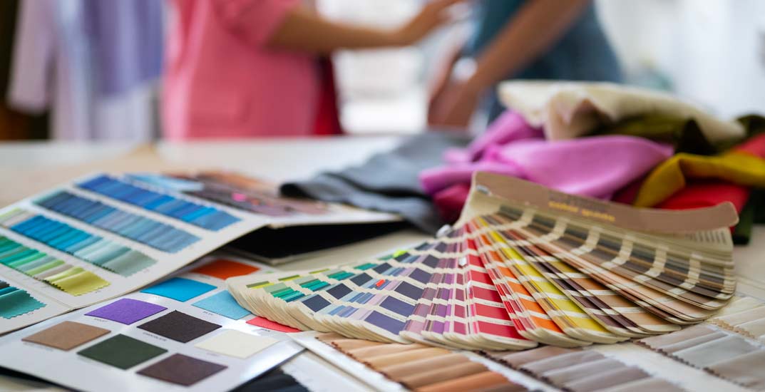
High contrast makes your design visible from a distance.
Low contrast makes it hard to read.
When customers come to us looking for screen printing logo maker recommendations or design advice, we guide them toward combinations that maintain clarity even after many washes.
Examples of high-contrast pairs:
- White + forest green
- Black + gold
- Navy + neon yellow
- Charcoal + white
- Red + black
Contrast gives your apparel presence, and presence is everything in branding.
Use 1-3 Colors for Stronger Visual Identity
Too many colors can overcrowd a design.
Simple palettes create stronger recognition.
Using 1-3 colors:
- Reduces print cost
- Makes designs feel modern
- Keeps your brand message clear
- Prints more reliably across all sizes
Some of Tampa’s standout brand apparel collections came from simple two-color combinations. This minimalistic approach is something we highlight in several of our design-focused blogs, subtle choices often create the strongest identity pieces.
Want to see the kind of work we deliver? Explore our full Portfolio !
Test Colors in Real Lighting Before Approving
Lighting changes everything.
Ink that looks rich indoors may appear muted outdoors.
Before finalizing your palette, we recommend checking your mockups in:
- Natural sunlight
- Warm indoor light
- Cool office light
This small step ensures your apparel looks consistent everywhere.
Let Your Printer Help You Match Accurate PMS Colors
Color accuracy matters most when you’re printing for branding.
To maintain consistency, we work with Pantone-matched inks.
This ensures:
- Your brand color stays exact
- Repeat orders look identical
- “Off shades” never disrupt your visual identity
This level of precision is one of the reasons businesses across Florida trust us for custom screen printing in FL and long-term apparel programs.
Think Emotionally- What Should Your Colors Make People Feel?
Different colors spark different feelings:
- Blue = Trust, professionalism
- Red = Energy, urgency
- Green = Calm, growth
- Black = Strength, sophistication
- Yellow = Optimism, friendliness
Your color palette becomes part of your brand personality.
And our clients often discover new sides of their identity during the color-planning stage, the moment their apparel stops being “just clothing” and becomes a story.
Quick FAQs
- How many colors should I use for screen-printed apparel?
Ans: 1-3 colors are ideal for clarity and cost efficiency. - Can I match my exact brand color?
Yes, we can match any Pantone shade. - What colors last longest on apparel?
High-contrast, mid-tone colors tend to stay vibrant for years. - Which color prints on fabric last the longest?
Dark, rich colors like black, navy and maroon wear best. - Which are best color logos for T-shirts.
White on black or black on white high contrast. - Why are my colors different on paper than on screen?
Screens use RGB; fabric printing uses CMYK, and they absorb ink differently. - What is the safest colour in corporate T-shirts?
They’re navy blue or white, practical for those that do have them, though few fans have more than a handful of events per year in them. - Which fabric shows colors best?
Brighter prints are on polyester; softer colors are on cotton.
Key Takeaways
And it’s not just about the way it looks, identity, longevity, ease of reading, audience psychology and brand consistency all apply to custom apparel colors too. And when you wear the right colors, your outfit will look okay inside of a Store!
Opt for colors that scream your brand, and are durable through dozens of washes.
A great print starts with smart use of color. At Trinity Graphics, we believe great apparel printing is equal parts precision, creativity, and reliability. Our team brings decades of experience, industry-leading technology, and a customer-first mindset to every bulk order. When you want prints that look sharp, last long, and represent your brand with confidence, we’re the Tampa partner you can trust.
Contact us to get your printing brand started!